Build a Theme Switcher in React Using styled-components and Redux
Learn how to build the theme switcher web app in React using styled-components and Redux.

In this tutorial, we will learn how to build a React app with fully customizable themes using the styled-components package.
I sometimes get pretty far into a web project and wish I had supported theming (or just done better CSS management in general) from the beginning. There are many component libraries (i.e., Material UI, etc…) that provide various UI elements with features that enhance basic HTML. These libraries usually also have their own theming mechanisms in place. Using styled-components as described in this article is fully compatible with Material UI and its theming approach. You can use the two hand in hand to enhance your app’s appearance.
When starting a new app, I recommend building a mini-design-system (a component library) for use within the app (assuming you aren’t already using an external design system). This just means defining some base components with specified styling and behaviors that can be used throughout your app. For example, you can create PrimaryButton React component that is always blue, 150px in width, (or whatever you want). I often see on large enterprise projects, that an app will use a library like Material UI, but specify the same style parameters all over the place like this:
<Button variant="outlined" size="small" color="primary"></Button>
If that’s how 90% of your buttons will look, don’t repeat yourself (DRY) and create a reusable component.
What we will learn:
- How to create a new React app using TypeScript
- How to use styled-components
- How to use Redux to globally change the theme in your app
All the code in this tutorial is on GitHub here: https://github.com/ezrabowman/react-theme-demo
Getting Started
The first thing we need to do is create the React app. I always use TypeScript, so I’ll start with that template. I will also use yarn instead of npm. If you are a javascript or npm purist, that’s ok. You will able to do all the things in this tutorial, although with slightly different syntax.
- Create the React App
> yarn create react-app react-themes --template typescript
- Test it out
> cd react-themes
> yarn start
Open your browser to http://localhost:3000. This might happen automatically for you.
Success! Our app is running.
Create Your First styled-component
- Install styled components
> yarn add styled-components --save
> yarn add @types/styled-components --dev
- Create a styled H1 component by modifying the App.tsx file as follows:
import React from 'react';
import styled from 'styled-components';
import logo from './logo.svg';
import './App.css';

const SytledH1 = styled.h1`
  color: red;
`;

function App() {
  return (
    <div className="App">
      <header className="App-header">
        <SytledH1>React Themes Demo</SytledH1>
        <img src={logo} className="App-logo" alt="logo" />
      </header>
    </div>
  );
}

export default App;
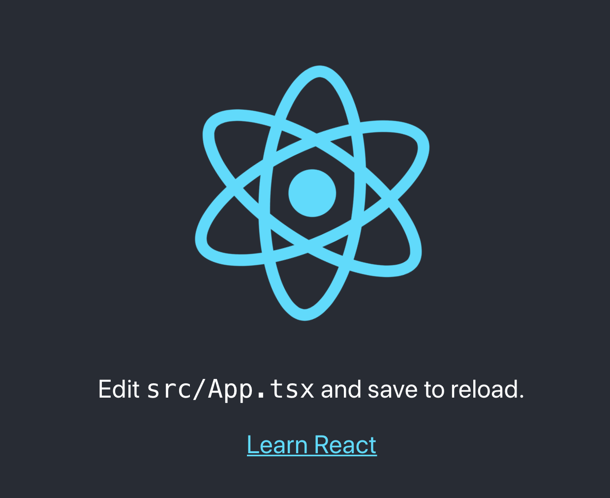
Let’s make the header text red so that it’s obvious our changes are taking effect. The styled-components package makes it easy to customize elements using standard CSS syntax. It also provides the added benefit of dynamically changing the CSS based on React props, which we will see in a moment. If all goes well you should see this:

Create a Global Style Using styled-components
- Using styled-components, you can also set global styles that will apply throughout the app, not just on a single component. Add the following to the App.tsx file to change the background color. We will also dynamically control this in the next few steps.
# change the styled-components import
import styled, { createGlobalStyle } from 'styled-components';

# add a global style
export const GlobalStyle = createGlobalStyle`
  body {
    background-color: white;
  }
`;

# insert the global style in the App component
function App() {
  return (
    <div className="App">
      <GlobalStyle/>
      <header className="App-header">
        <SytledH1>React Themes Demo</SytledH1>
        <img src={logo} className="App-logo" alt="logo" />
      </header>
    </div>
  );
}
- We also need to delete some of the default stylings from the boilerplate create-react-app. Delete the background-color and color lines from the App.css file, so they don’t overrule our new global styles.
.App-header {
  background-color: #282c34;
  min-height: 100vh;
  display: flex;
  flex-direction: column;
  align-items: center;
  justify-content: center;
  font-size: calc(10px + 2vmin);
  color: white;
}
Here’s how the app should look now:

Create Different Themes
- Add a themes.ts file at the top level of the project. If you are creating complex themes, you probably want to separate these into individual files, but we can use a single file for this exercise.
themes.ts
export const darkTheme = {
  backgroundColor: "#333333",
  textColor: "#000000",
  primary: "#77ccdd"
}

export const lightTheme = {
  backgroundColor: "#e0e0e0",
  textColor: "#ffffff",
  primary: "#55aacc"
}

export const partyTheme = {
  backgroundColor: "#eeff00",
  textColor: "#ff88cc",
  primary: "#aa00ee"
}
- Add the styled-components theme provider. This feature is what allows your themes to propagate throughout the app. In the App.tsx file, make the following changes:
# add ThemeProvider to the styled-components import
import styled, { createGlobalStyle, ThemeProvider } from 'styled-components';

# add an import for the darkTheme we just created
import { darkTheme } from './themes';

# Wrap the entire render content in the theme provider
function App() {
  return (
    <ThemeProvider theme={darkTheme}>
      <div className="App">
        <GlobalStyle/>
        <header className="App-header">
          <SytledH1>React Themes Demo</SytledH1>
          <img src={logo} className="App-logo" alt="logo" />
        </header>
      </div>
    </ThemeProvider>
  );
}
At this point, if you run the app, nothing has changed. Why? We haven’t applied the theme’s values to any of our components yet.
- Make our styled-components use the theme values. In the App.tsx file, modify the GlobalStyles and StyledH1.
const GlobalStyle = createGlobalStyle`
  body {
    background-color: ${(props: any) => props.theme.backgroundColor};
  }
`;

const SytledH1 = styled.h1`
  color: ${(props: any) => props.theme.primary};
`;
The ThemeProvider that we added in the last step adds a ‘theme’ prop to all styled-components under it in the component tree. Since we put the provider at the top, all our styled-components will have access to the theme prop.
Check out your app now. The title and background have changed colors according to the dark theme.

- Test an alternate theme. In the App.tsx file, change to the light theme:
# add lightTheme to the imports; add the party one there too
import { darkTheme, lightTheme, partyTheme } from './themes';

# Change the theme used by the provider
<ThemeProvider theme={lightTheme}>
Now the app should have the light theme applied and look like this:

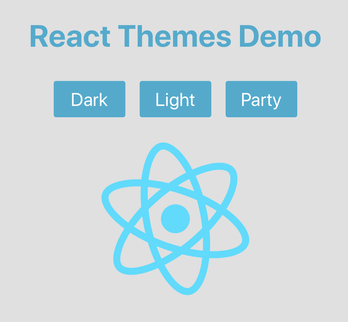
Add Buttons for Switching Themes
Now for the fun part. All we need to do is be able to dynamically change the theme value on the ThemeProvider. To do this, we will create a new component with 3 buttons, and use Redux to maintain the theme state.
- Create a theme selector component by adding a new file called ThemeSelector.tsx
import React from 'react';
import styled from 'styled-components';
import { darkTheme, lightTheme, partyTheme } from './themes';

const StyledButton = styled.button`
  color: ${(props) => props.theme.textColor};
  background-color: ${(props) => props.theme.primary};
  box-shadow: none;
  border: 0px;
  border-radius: 4px;
  font-size: 1.2em;
  min-width: 120px;
  padding: 12px;
  margin: 12px;
`;

const ThemeSelector = () => {

  const changeTheme = (theme: any) => {
    console.log(theme);
  }

  return (
    <div>
      <StyledButton onClick={() => changeTheme(darkTheme)}>Dark</StyledButton>
      <StyledButton onClick={() => changeTheme(lightTheme)}>Light</StyledButton>
      <StyledButton onClick={() => changeTheme(partyTheme)}>Party</StyledButton>
    </div>
  );
}

export default ThemeSelector;
Several things are going on in this file. First, notice that we created a StyledButton component that is colored according to our theme. We added three instances of that button to our ThemeSelector component - one for each theme. They all call a changeTheme() function that we will use in the next steps. For now, just log the new theme we are trying to apply to test out our buttons.
- Add the ThemeSelector to App.tsx:
function App() {
  return (
    <ThemeProvider theme={lightTheme}>
      <div className="App">
        <GlobalStyle/>
        <header className="App-header">
          <SytledH1>React Themes Demo</SytledH1>
          <ThemeSelector></ThemeSelector>
          <img src={logo} className="App-logo" alt="logo" />
        </header>
      </div>
    </ThemeProvider>
  );
}
If you run the app now, you should see the new buttons we added for switching themes. When you click on them, you should see the theme values logged in the dev tools console.
Add Redux to Manage State
Redux is probably overkill for this small sample app but would help when building a more extensive app.
- Install Redux
> yarn add redux --save
> yarn add react-redux --save
> yarn add @types/react-redux --dev
- Create a Redux action and reducer. This tutorial is not going into depth on how or why Redux does what it does. For our purposes, Redux is a single point of truth that holds which theme has been selected in the app. You set values in the store by dispatching actions and you read values from the store by selecting values in the store. Create a ‘redux’ folder with the following two files:
> mkdir redux
redux/themeActions.tsx
export const APPLY_THEME = "APPLY_THEME";

export const applyTheme = (theme: any) => {
  return {
    type: APPLY_THEME,
    payload: theme
  };
};
redux/themeReducer.tsx
import * as Actions from './themeActions';
import { darkTheme } from '../themes';

const initialState = {
  theme: darkTheme
};

export const themeReducer = (state: any = initialState, action: any) => {
  switch (action.type) {
    case Actions.APPLY_THEME:
      return Object.assign({}, { theme: action.payload } );
    default:
      return state;
  }
};
- Set up the Redux store. Edit the index.tsx file as follows. This wraps the entire app in a redux Provider that makes the store available to all components within the app.
import React from 'react';
import ReactDOM from 'react-dom';
import { createStore } from 'redux';
import { Provider } from 'react-redux';

import './index.css';
import App from './App';
import * as serviceWorker from './serviceWorker';
import { themeReducer } from './redux/themeReducer';

const store = createStore(themeReducer);

ReactDOM.render(
  <React.StrictMode>
    <Provider store={store}>
      <App />
    </Provider>
  </React.StrictMode>,
  document.getElementById('root')
);

serviceWorker.unregister();
- Set up the ThemeSelector to dispatch the APPLY_THEME_ action:
const ThemeSelector = () => {
  const dispatch = useDispatch();

  const changeTheme = (theme: any) => {
    dispatch(applyTheme(theme));
  }

  return (
    <div>
      <StyledButton onClick={() => changeTheme(darkTheme)}>Dark</StyledButton>
      <StyledButton onClick={() => changeTheme(lightTheme)}>Light</StyledButton>
      <StyledButton onClick={() => changeTheme(partyTheme)}>Party</StyledButton>
    </div>
  );
}
- Set up App.tsx to select the theme from the store:
function App() {
  const theme = useSelector((state: any) => state.theme);

  return (
    <ThemeProvider theme={theme}>
      <div className="App">
        <GlobalStyle/>
        <header className="App-header">
          <SytledH1>React Themes Demo</SytledH1>
          <ThemeSelector></ThemeSelector>
          <img src={logo} className="App-logo" alt="logo" />
        </header>
      </div>
    </ThemeProvider>
  );
}
Run the app now and you have a fully functioning theme switching app.
Conclusion
Thanks for reading! Please leave feedback and let me know if you enjoyed this post. I have other articles on DevOps, cloud architectures, and web development here and on Medium - https://medium.com/@ezrabowman.